1. Double Top Pattern
The double top is a bearish reversal chart pattern that forms after an uptrend and signals a potential trend change from bullish to bearish. The double top is characterized by two consecutive peaks that reach approximately the same price level, separated by a moderate trough.
The pattern resembles the letter “M” and consists of several key components: an initial uptrend leading to the first peak, a pullback or consolidation period that forms a trough, a second attempt to move higher, which fails to surpass the first peak, and a breakdown below the support level (neckline) that confirms the pattern. Look at the image below.
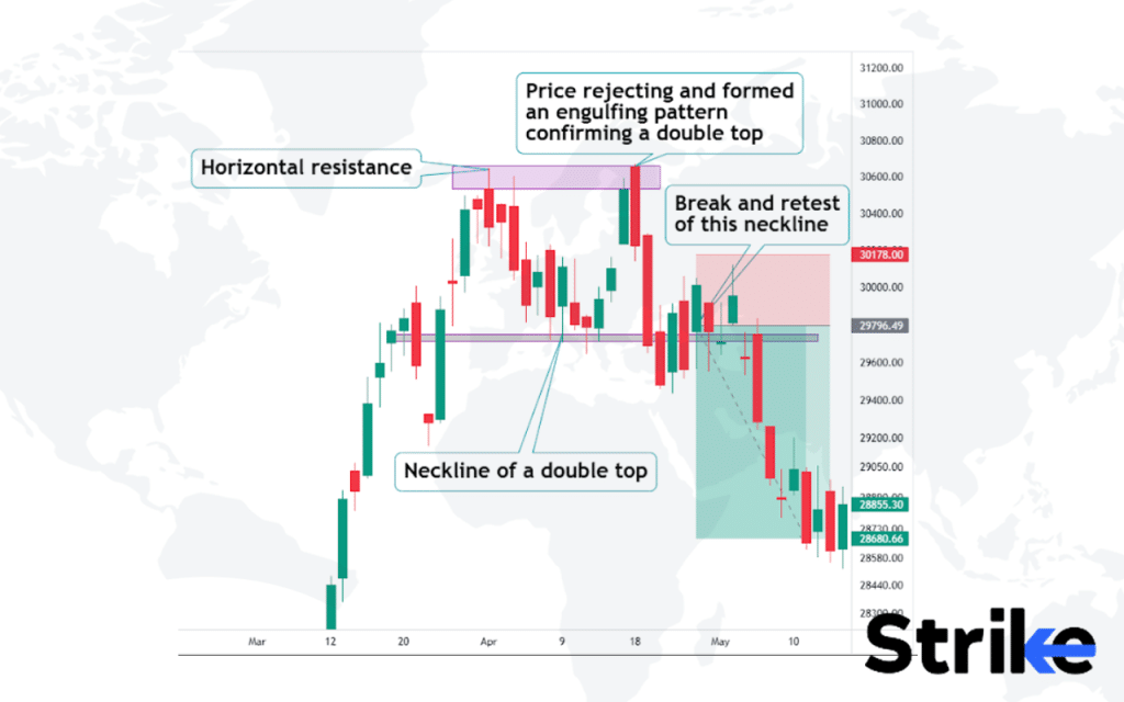
The two peaks should form at roughly the same level, indicating strong resistance. The pattern is complete when the price drops below the support level, known as the neckline, which is formed by connecting the lowest points of the trough between the peaks. The double-top pattern reflects a shift in market sentiment from bullish to bearish. The first peak represents the test of the resistance level, where sellers start to emerge. The pullback to the trough indicates a temporary recovery before the second attempt to move higher.
Traders often use double tops to identify potential short-selling opportunities or to exit long positions. After the double top pattern is confirmed by a breakdown below the neckline, traders anticipate further price declines. The price target is typically measured by projecting the distance between the peaks and the neckline downward from the breakdown point.
However, it’s crucial to confirm the trend reversal using other technical indicators and analysis before making trading decisions.
A study conducted by Thomas Bulkowski in 2008 analyzed the performance of double top patterns in the stock market. His research revealed that the double top pattern had a success rate of 73%.
2. Double Bottom Pattern
The double bottom is a bullish reversal chart pattern that forms after a downtrend and signals a potential trend change from bearish to bullish. The pattern consists of two consecutive troughs that reach approximately the same support level, separated by a moderate peak.
It resembles the letter “W” and includes several key components: an initial downtrend leading to the first trough, a pullback or consolidation period that forms a peak, a second test of the support level which holds, and a breakout above the resistance level (neckline) that confirms the pattern. See the image below.
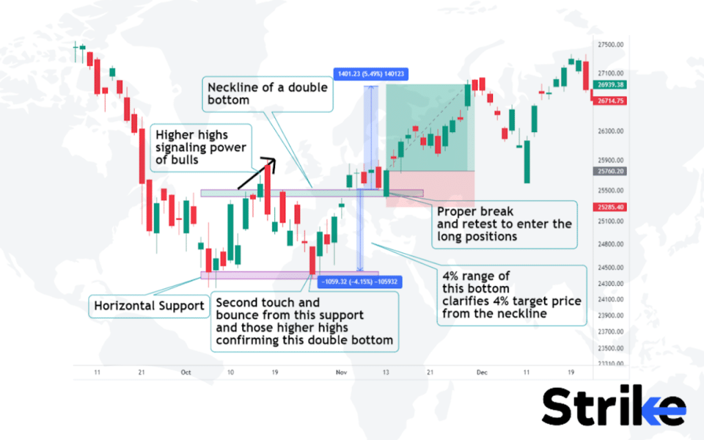
Double bottom forms when the price shows signs of rejection from the strong horizontal support line. The presence of candlestick patterns at the bottom and signals from additional indicators are gathered to confirm a trade setup. Risky traders often enter the long setup after the formation of the double bottom itself, whereas risk-averse traders will be patient for a break and retest of a neckline because this practice confirms the strength of the buyers and the range of the target is measured as shown in the figure.
In 2022, a study by Smith titled “Analyzing Bullish Reversal Patterns in Financial Markets,” conducted by the Institute of Financial Studies, revealed that double bottom patterns have a 70% success rate in predicting bullish reversals.
3. Ascending Triangle Pattern
The ascending triangle is a bullish continuation chart pattern that forms during an uptrend as a consolidation period before further gains. It is characterised by horizontal resistance. and rising support that converges to form a triangular shape. See the image below.
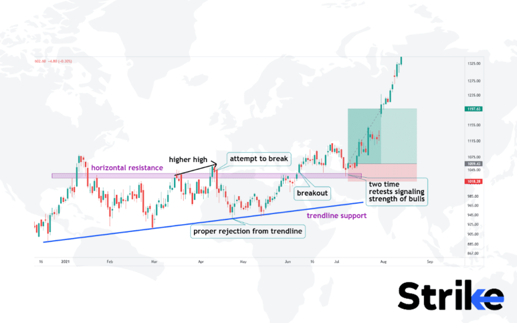
The rejections from the trendline support and certain higher highs before touching the trendlines are taken as solid indications to go bullish on the trade setup. However, risk-averse and conservative traders often wait for additional confirmation. As in the image above, conservative traders will wait for the horizontal resistance to finally break and retest this broken resistance. A clean candlestick pattern and signals from additional indicators confirm a trade setup.
Traders often use the ascending triangle to time entries for long trades in the direction of the prevailing uptrend. Stop losses are placed below the entry setup or candlestick setup, while profit-taking targets are set using the measured move projection.
Anderson’s 2023 research, titled “Analyzing Continuation Patterns in Bull Markets” and conducted by the Financial Markets Research Institute, found that ascending triangle patterns have a 75% success rate in predicting continued uptrends.
4. Descending Triangle Pattern
The descending triangle is a bearish reversal chart pattern that forms after an uptrend and signals a potential trend change from bullish to bearish. The descending triangle shows a series of lower highs and lower lows, where a downtrending support line forms the hypotenuse of the triangle and a horizontal resistance line forms the base. The pattern resembles a downward sloping channel on the chart, like in the image below.
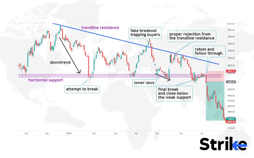
The rejections from the trendline resistance and certain lower lows before touching the trendlines are taken as solid indications to go bearish on the trade setup. However, risk averse and conservative traders often wait for additional confirmation. As in the image uploaded above, conservative traders will wait for the horizontal support to finally break and retest this broken support.
A clean candlestick pattern and signals from additional indicators confirm a trade setup The bounces off support show some buying interest trying to emerge, but this buying is weaker each time, as evidenced by the lower lows. The support line holds for a time before eventually breaking down. Alternatively, bulls could regain control and invalidate the pattern with a break above resistance. This could lead to a continuation of the prior uptrend. Traders watch for an increase in volume on the breakdown for signs of selling pressure to get confirmation.
Trevor Davis’ 2023 study, “Reversal Patterns in Bear Markets,” conducted by the Market Analysis Institute, found that descending triangles have a 68% success rate in predicting reversals from bullish to bearish trends.
5. Symmetrical Triangle Pattern
The symmetrical triangle is a continuation chart pattern that forms as the price oscillates between two converging trendlines. The symmetrical triangle indicates a period of indecision where neither buyers or sellers are in control. The pattern looks like a coil or a pennant and consists of several key components: the two converging trendlines, a contraction in volatility, and an eventual breakout from the pattern. See the image below for reference.
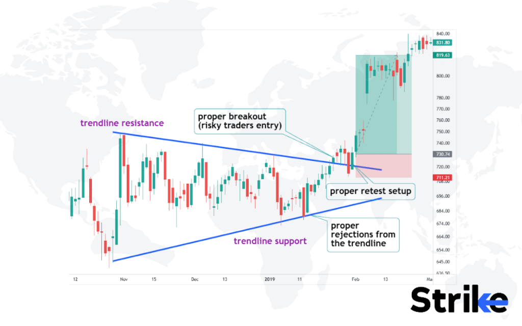
The upper and lower trendlines converge at a roughly similar angle, indicating the balanced force of buyers and sellers. The pattern is complete when the price breaks out above the upper trendline resistance or below the lower trendline support. The direction of the ensuing move depends on the direction of the preceding trend. Volume tends to decline during the formation of this pattern, indicating indecision in the market.
Traders often use symmetrical triangles to anticipate potential breakouts and trade resumptions of the prior trend. However, other technical analysis should confirm the validity of the pattern before trading the breakout.
A research by Nate Anderson in 2023, titled “Continuation Patterns and Market Trends,” conducted by the Technical Analysis Institute, found that symmetrical triangle patterns have a 70% success rate in predicting trend continuations.